ShopDreamUp AI ArtDreamUp

Deviation Actions
Boa's Creative Collective
Dive into Boa's Creative Collective! Access 300+ high-quality digital artworks monthly, spanning diverse styles. Be the first to enjoy landscapes, character designs, and more. Join our community of art enthusiasts, celebrating creativity and exclusive access. Immerse in boundless artistic imagination today!
$3/month


Suggested Deviants


Suggested Collections


You Might Like…


Featured in Groups


Description
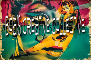
Was trying to capture the life, energy, and busyness of New York. Lots of the patterns/textures are inspired by New York architecture and landmarks.
Any critique would be much appreciated!
EDIT: toned down the detail in the statue of liberty, as one critiquer suggested. added a skyline to the top, as well as more detail overall. had a play with different colour schemes, and i think this is the one i like most.
Featured: [link]
Any critique would be much appreciated!
EDIT: toned down the detail in the statue of liberty, as one critiquer suggested. added a skyline to the top, as well as more detail overall. had a play with different colour schemes, and i think this is the one i like most.
Featured: [link]
Image size
5465x8000px 8.71 MB
© 2012 - 2024 graphiqual
Comments17
Join the community to add your comment. Already a deviant? Log In
This is a really neat typography <img src="e.deviantart.net/emoticons/c/c…" width="20" height="20" alt="
I like how you've got a bit of the New York skyline on the letters, and the Statue of Liberty <img src="e.deviantart.net/emoticons/d/d…" width="21" height="15" alt="
I like the interesting pattern above it. Without this I feel that the typography wouldn't be complete. It really helps to add a "big city' feel somehow.
They way the letters are cut and designed similarly to the pattern above is perfect. If you'd not done it this way, it wouldn't have been as eye catching.
The colours you've used are cool - although maybe the colours of the American flag would have been better? Who knows. I think you should give it a try and upload a different version to see how it works out <img src="e.deviantart.net/emoticons/n/n…" width="15" height="15" alt="